CompoCloset Homepage Concept
Draft homepage direction using the brand’s actual green/black visual language and the leaf asset from the live site.
Design direction
Better toilets for people & the planet.
Make the homepage feel premium, clean, and confident — with one sharp statement, one obvious path, and one immediate visual hook.
Hero copy idea: “Waterless toilets for vans, boats, cabins, and off-grid living.”
Proposed homepage structure
1. Hero
Headline, subhead, product visual, primary CTA, secondary CTA.
2. Why it wins
Odour control, waterless use, easy emptying, off-grid fit.
3. Choose your use case
Vans, RVs, boats, tiny homes, off-grid, home use.
4. Proof
Reviews, install photos, FAQ snippets, warranty/trust badges.
Homepage components I would use
Hero
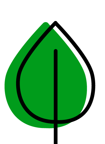
● Dark background
● Large leaf mark
● Green CTA buttons
Value strip
● Waterless
● Odour controlled
● Built for off-grid life
Decision block
● Choose your vehicle/home type
● Compare models
● Shop the right product
Suggested hero layout copy
Headline
Waterless toilets for vans, boats, cabins, and off-grid living.
Say goodbye to chemical toilets and hello to a cleaner, simpler, lower-impact way to go.
My recommendation
Use this as the visual direction: black-first, green accents, a single strong hero message, and a decision-led homepage. The site should feel less like a catalogue and more like a premium guide to the right toilet.